mirror of
https://codeberg.org/forgejo/forgejo.git
synced 2024-11-24 11:31:54 +01:00
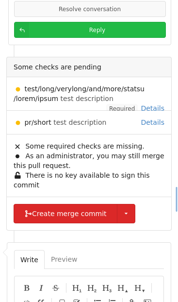
This PR fixes the layout of PR status layouts on mobile. For longer status context names or on very small screens the text would overflow and push the "Details" and "Required" badges out of the container. Before:  After:  Co-authored-by: Lunny Xiao <xiaolunwen@gmail.com> |
||
|---|---|---|
| .. | ||
| commits.tmpl | ||
| files.tmpl | ||
| fork.tmpl | ||
| status.tmpl | ||
| tab_menu.tmpl | ||